According to the CBSE Syllabus 2023-24, this chapter has been renumbered as Chapter 4.
CBSE Data Handling Class 8 Notes – Chapter 5
In Class 8 Chapter 5 Data handling, students will learn about raw data and organised data, how to represent data using pictograph, bar graph, double bar graph, pie chart. Students will also come across the concept of Chance and probability with the help of real life examples.
What is Data handling?
Data handling is referred to the procedure done to organize the information provided in order to perform mathematical operations on them. It means collecting the raw data and presenting them in a particular form. This data can be in any form like in numbers, in words, etc. There are usually two types of data, they are:
To know more about Data handling, visit here.
For more information on Data Handling, watch the below video
Pie Charts
A pie chart shows the relationship between a whole circle and its parts. The circle is divided into sectors. The size of each sector is proportional to the information it represents. Pie charts are also known as circle graphs.
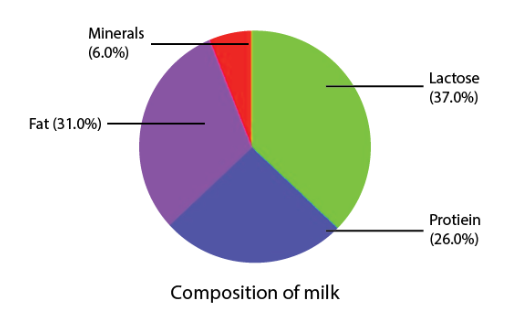
The above pie chart shows the composition of milk.
To know more about Pie Charts, visit here.
Creating Different Pie Charts
For creating a pie chart the following steps needs to be followed:
- For each list of item or activity calculate the fraction or part which it represents.
- Convert each fraction into degrees by multiplying it with 360∘.
- Draw a circle and divide it into sectors. The central angle of each sector is equal to the fraction of 360∘ as calculated above.
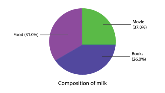
| Item | Amount | Fraction | Angle |
| Movie | Rs. 30 | \(\begin{array}{l}\frac{30}{120}=\frac{1}{4}\end{array} \) |
\(\begin{array}{l}\frac{30}{120}\times 360=90^\circ\end{array} \) |
| Book | Rs. 50 | \(\begin{array}{l}\frac{50}{120}=\frac{5}{12}\end{array} \) |
\(\begin{array}{l}\frac{50}{120}\times 360=150^\circ\end{array} \) |
| Food | Rs. 40 | \(\begin{array}{l}\frac{40}{120}=\frac{1}{3}\end{array} \) |
\(\begin{array}{l}\frac{40}{120}\times 360=120^\circ\end{array} \) |
Each sector in the pie chart is proportional to the amount spent for that particular activity or item.
Introduction to Data Handling
Raw Data
Raw data is also known as primary data which is available in an unorganized form. The examples of raw data are:
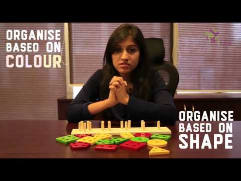
Organisation of Raw Data
Raw data is unorganised. To draw meaningful inferences we organise data. There are various ways in which we can organise data. For example, we can organise raw data using Frequency distribution table, Bar graphs etc. Check an example below to understand the organising the data.
For more information on Organising Data and Grouped Distribution Table, watch the below video.

Pictographs and Bar Graphs
For more information on Pictographs and Bar Graphs, watch the below videos.

To know more about Pictographs, visit here.
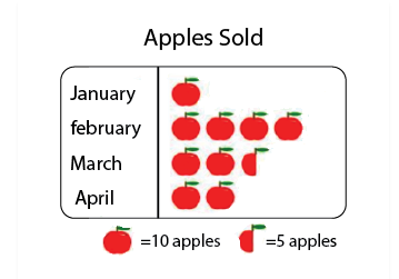
Pictographs
A pictograph is the pictorial representation of data using symbols.
For example, If 10 Apples were sold in January, 40 were sold in February, 25 were sold in March, and 20 were sold in April. We can represent the given data as a pictograph as given below:
Scale Factor
The scale factor is the ratio of the length of a side of one figure to the length of the corresponding side of the other figure. The scale factor is used in making maps. The scale of a map is the ratio of a distance on the map to the corresponding distance on the ground.
Learn more about scale factor with examples here: Scale Factor
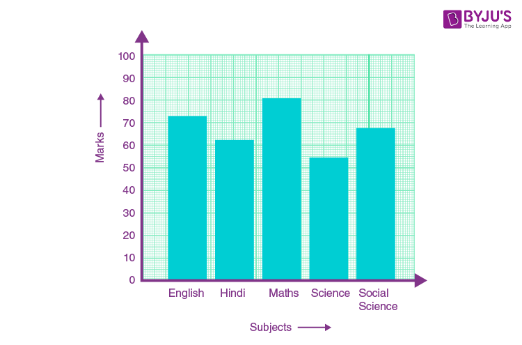
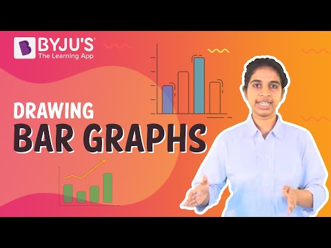
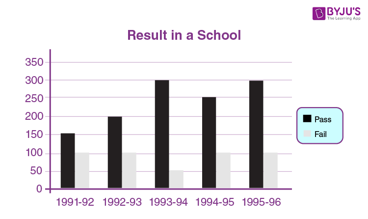
Bar Graphs
A bar graph is a representation of data using a rectangular bars that are having heights that are proportional to the values that are represented by them.
For example, the result in a school is displayed using a bar graph below that shows the number of students passed and failed in each year.
To know more about Bar Graphs, visit here.
Multiple Bar Graphs
Multiple bar graphs is a bar graph which is used for comparing more than one kind of information.
Example:
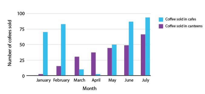
The above figure is a double bar graph. It shows the number of cup of coffees sold in cafes and canteens for the months January, February, March, April and May, June and July.
For more information on Easiest Way To Compare Quantities – Bar Graphs , watch the below video
Grouped Data
Frequency
Frequency is the number of times that a particular observation/event occurs. For example, if four students have scored between 60 to 70 marks, then the frequency of 60 to 70 marks is 4.
To know more about Grouping Data, visit here.
Grouped Frequency Distribution
In a grouped frequency distribution a large amount of raw data is represented by making groups or class intervals and obtain a frequency distribution of the number of observations falling in each group.
The marks scored(out of 100) by the students of class 10th are given below:
93,98,87,65,75,77,67,88,67,97,72,73,75,90.
The above data can be represented as a frequency distribution table:
| Marks | Frequency |
| 60-70 | 3 |
| 70-80 | 5 |
| 80-90 | 2 |
| 90-100 | 4 |
Here, 60-70, 70-80, 80-90, 90-100 are the class intervals.
In the class interval 60-70, 60 is the lower limit and 70 is the upper limit.
Class width or size = upper limit – lower limit
Note:
- The value equal to the upper limit is not included in that class interval. It is included in the next higher class interval. For example, here in the case of 90, it is not included in the class interval 80-90, it is included in the class interval 90-100.
To know more about Frequency Distribution Table, visit here.
Tally Marks
Tally marks are used to represent and count data. In tally marks, one vertical line is made for each count for the first four numbers and the fifth number is represented by a diagonal line across the previous four. The table below shows the tally marks for the numbers 1 to 10.
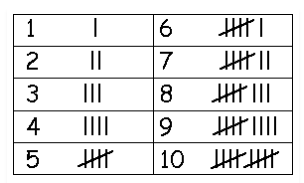
Tally marks representation for 1 to 10
For example, tally marks for number 4 is ||||.
To know more about Tally Marks, visit here.
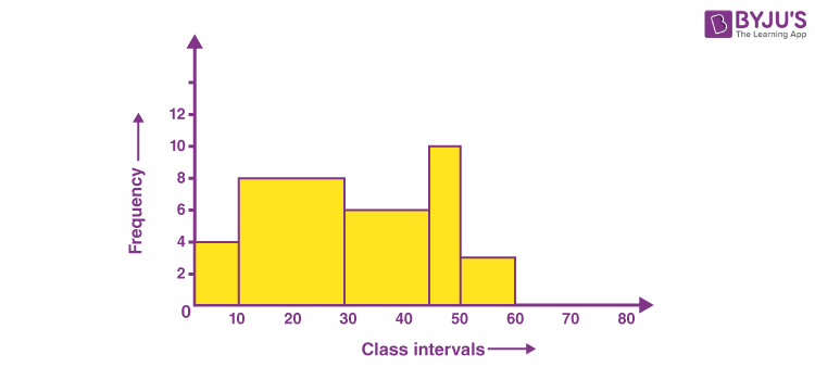
Histogram
A Histogram is a type of bar diagram, where:
- The horizontal axis represent the class intervals.
- The frequency of the class interval is represented by the height of the bars.
- Since there is no gap between the class intervals, there is no gap between the bars.
Below is an example of histogram which has no gaps between the bars.
For more information On Histograms, watch the below video.

To know more about Histogram, visit here.
Equally Likely Outcomes
Random Experiment
A random experiment is an experiment for which the outcome cannot be predicted with certainty. Example: Rolling a dice.
Experiment and Outcomes
An Experiment is any procedure that can be infinitely repeated and has a well-defined set of possible outcomes, known as the sample space.
Each outcome of an experiment or a collection of outcomes makes an event.
For example, rolling of a die is an experiment. Getting 1, 2, 3, or getting even numbers when a die is rolled is an event.
Equally Likely Outcomes
Equally likely outcomes are those which have the same chance of occurring.
Example: Tossing a coin – the probability of getting a head and probability of getting a tail is equal.
Probability of an Event
Probability is the likelihood of occurrence of an event. An event is a set of outcomes of an experiment.
When the outcomes of an experiment are equally likely, the probability of an event is given by:
For example, when die is rolled, the probability of 4 to come will be:
P(E) = 4/6 = 2/3
For more information on Probability, watch the below video.

To know more about Probability, visit here.
Experimental Probability
When we toss a coin we get only one outcome either a head or a tail. The probability of getting a head or a tail is 0.5.
However, if a coin is tossed ten times its not necessary that we will get a head five times and a tail five times.
So, based on what we observe as the outcomes of our trials, we find the experimental or empirical probability.
Experimental or empirical probability:
To know more about Experimental Probability, visit here.
Related Articles
Class 8 Maths Chapter 5 Data Handling MCQs
Important Questions Class 8 Maths Chapter 5 Data Handling
NCERT Solutions for Class 8 Maths Chapter 5 Data Handling
Frequently asked Questions on CBSE Class 8 Maths Chapter 5 Data Handling
What is a Pie chart?
Pie charts can be used to show percentages of a whole and represents percentages at a set point in time.
What is Raw data?
Raw data (primary data) is data that has not been processed for use.
What is known as Scale factor?
A scale factor is usually a decimal which scales, or multiplies, some quantity.
Comments